Discussion Options
Discussion stages are the heart of most Deliberation Lab studies. This guide documents the discussion configuration object you can attach to any stage to enable synchronized text chat or video calls, along with optional breakout rooms and custom layouts.
Include the discussion block at the stage level, alongside duration, elements, etc.:
gameStages:
- name: Topic Discussion
duration: 600
discussion:
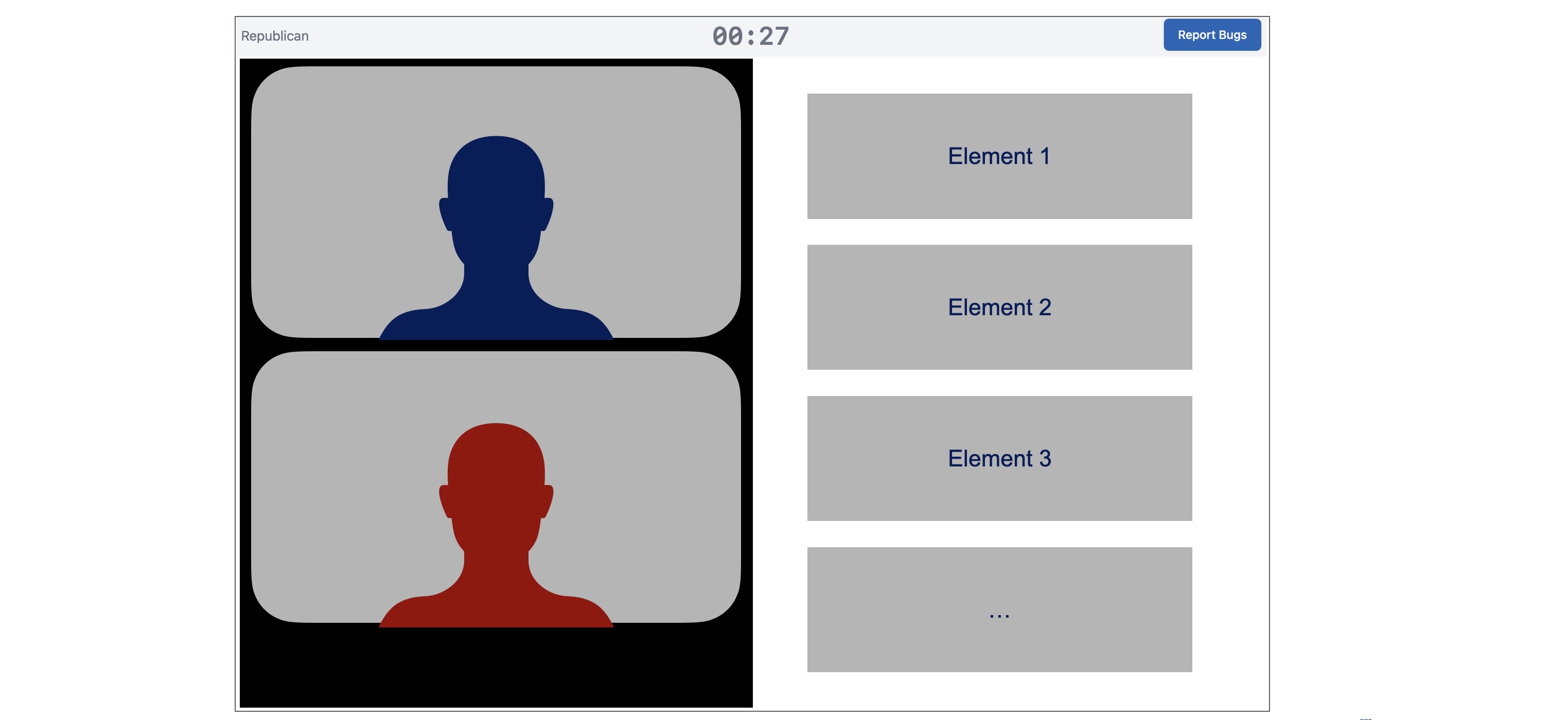
chatType: video
showNickname: true
showTitle: false
elements: ...
Discussion stages include the discussion interface (text chat or video call) in the left hand side of the window, and a display of elements (formatted in the same way as other stages) in the right-hand column.
Universal Options
chatType(required):"text"or"video".showNickname(defaulttrue): Display player nicknames. If false in text chat, displays player positions.showTitle(defaultfalse): Display player titles (if defined).showToPositions/hideFromPositions: Restrict which zero-based player indices see the discussion component at all (applies to both chat types). Invalid indices fail preflight validation.
Text Chat (chatType: "text")
Additional fields:
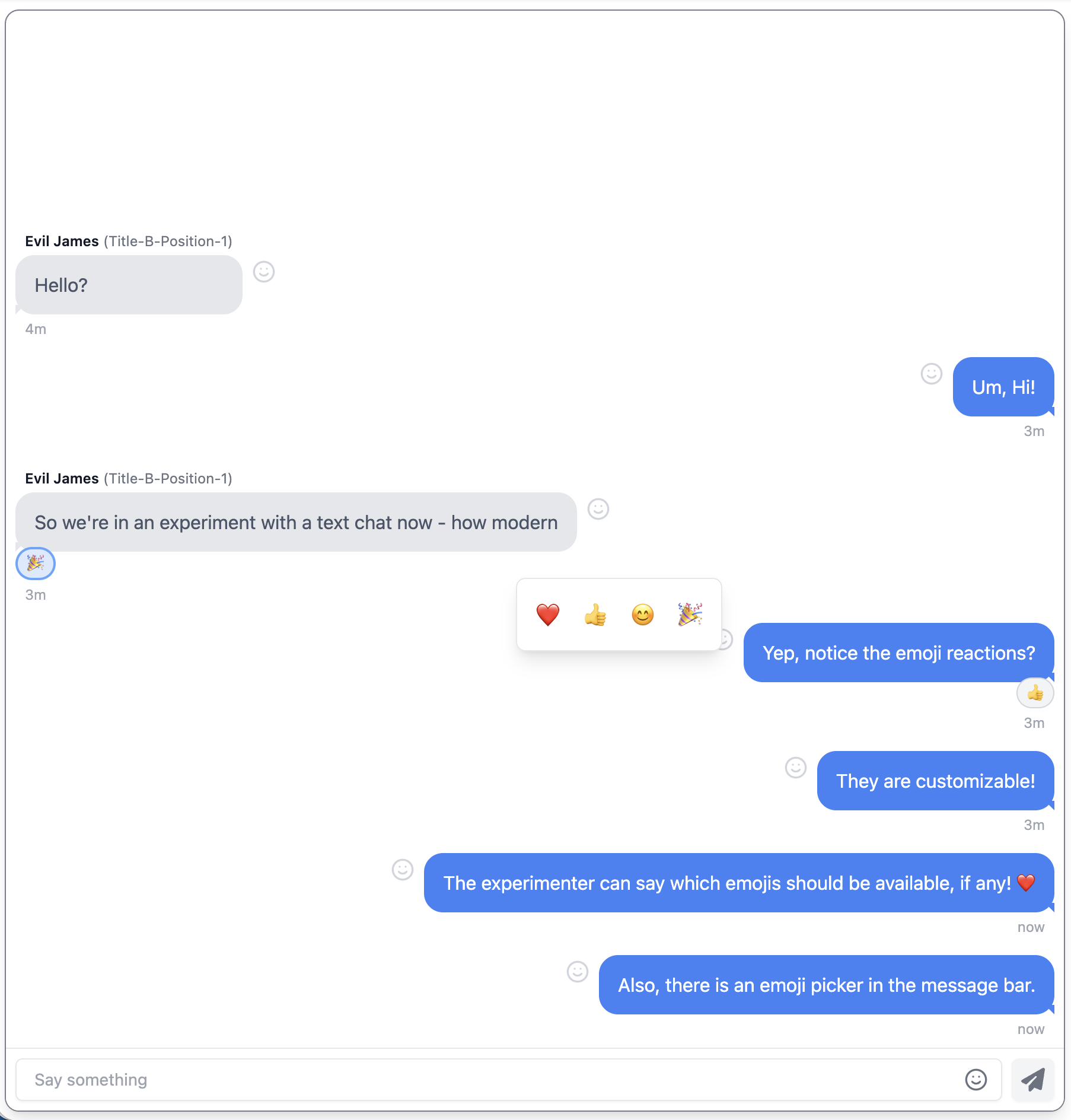
reactionEmojisAvailable: Array of emojis participants can use for reactions and in text entry bar. Empty/omitted disables reactions.reactToSelf(defaulttrue): Allow reacting to your own messages.numReactionsPerMessage(default1): Maximum distinct reactions a single participant can add to one message.
Example:
discussion:
  chatType: text
  showNickname: true
  reactionEmojisAvailable: ["❤️", "👍", "😊", "🎉"]
  reactToSelf: true
  numReactionsPerMessage: 1
Video Chat (chatType: "video")
The default videocall layout uses a responsive grid that adjusts the number of columns to maximize the size of each video. Positions on the screen are randomized, but the same for each participant, and consistent across disconnect/reconnect events. This is the option that most studies should use, unless you are specifically testing the effects of particular video call layouts.
Within this default, you can configure:
showSelfView(Optional, defaulttrue): Hide/show the participant's own tile.showReportMissing(Optional, defaulttrue): Show/hide the "Report Missing Participant" button. Set tofalsefor breakout room scenarios where the automatic stage-advance behavior is undesirable.showAudioMute(Optional, defaulttrue): Show/hide the audio mute button in the video call tray. Set tofalseto prevent participants from muting their microphone.showVideoMute(Optional, defaulttrue): Show/hide the video mute button in the video call tray. Set tofalseto prevent participants from turning off their camera.rooms: (Optional, defaults to include all participants). Define breakout rooms by listing which study positions (e.g. 0, 1, 2, ...) should be included in each room. Ifroomsis included, all players who are shown the discussion component (i.e., are included inshowToPositionsor excluded fromhideFromPositions) must be assigned to exactly one room.
discussion:
  chatType: video
  rooms:
    - includePositions: [0, 1]
    - includePositions: [2, 3]
Custom Layouts
For fine-grained control, use layout in place of rooms. Each entry in the layout object is a key/value pair, where the value is an object that specifies what video streams or placeholder tiles will be displayed, and where, and the key is the experiment position (e.g. 0, 1, 2...) that they are shown to. This means you can define a different layout for each participant in the study, and control exactly which video an audio streams they observe, and how they are laid out.
The layout model uses a grid system. The grid element of each layout definition specifies the number of rows and columns to use in laying out video or placeholder tiles. You can use any number of grid cells, and then define display regions covering one or more rows and columns. This means you could do a 2x2 grid and display 4 participants in cells [0, 0], [0, 1], [1, 0], [1, 1], or do a 100x100 grid, and specify the region that each tile should be placed in using percentages - or something else entirely. Within the grid, display regions are zero-based and inclusive, and start in the top-left corner.
The feeds element of each layout definition includes a list of video and/or audio streams taken from particular participants, where in the grid to place them, and then the "z" order (i.e., what layer to place the streams in, with higher numbers being on top).
sourcetypes can include either anotherparticipantor the participant themself:self. When the feed comes from another participant, indicate theposition(e.g., 0, 1, 2...) that the stream is coming from.displayRegionobjects contain an entry forrowsandcolumns. These can take either a single integer, in which case they represent the single row/column that the tile is placed within, or they can take an object with keysfirstandlast, indicating the first and last row or column included in the display region.
Layouts must be specified for all participants who are shown the discussion component (i.e., are included in showToPositions or excluded from hideFromPositions), but not all participants need to be displayed in any layout.
Example
The following example shows the participant at position 0 their own camera view picture-in-picture at the bottom center of the video call, with their partner (position 1) taking up the full videocall window. To the participant assigned position 1 in the group, it shows a side-by-side layout with their partner (position 0) in the left half, and their self-view in the right half.
discussion:
  chatType: video
  layout:
    0:
      grid:
        rows: 100
        cols: 100
      feeds:
        - source: { type: "participant", position: 1 }
          media: { audio: true, video: true }
          displayRegion:
            rows: { first: 0, last: 99 }
            cols: { first: 0, last: 99 }
          zOrder: 5
        - source: { type: "self" }
          media: { audio: false, video: true }
          displayRegion: # show self view picture-in-picture at the bottom center of the video call
            rows: { first: 45, last: 55 }
            cols: { first: 80, last: 99}
          zOrder: 10
    1:
      grid: {rows: 1, cols: 2}
      feeds:
        - source: { type: "participant", position: 0 }
          media: { audio: true, video: true }
          displayRegion: {rows: 0, cols: 0}
        - source: { type: "self" }
          media: { audio: false, video: true }
          displayRegion: {rows: 0, cols: 1}
      ...
Common Patterns
- Simple text chat:
yaml
  discussion:
    chatType: text
    showNickname: true
    showTitle: false
- Video with hidden self view:
yaml
  discussion:
    chatType: video
    showSelfView: false
    showNickname: true
- Video with mute controls disabled:
yaml
  discussion:
    chatType: video
    showAudioMute: false
    showVideoMute: false
    showNickname: true
- Text chat visible only to specific positions:
yaml
  discussion:
    chatType: text
    showToPositions: [0, 2]
    showNickname: true
Refer back to treatment-overview.md for how positions are assigned, and to page-elements.md for companion elements (prompts, timers, submit buttons) that commonly accompany a discussion stage.